The color of the year (and my favorite color too)
Who doesn't know the global company Pantone?
Fenton is an American color manufacturing company, best known for its color matching method that stems from strict rules and precise methods for matching colors. Its color matching method is applied in diverse industries, mainly in the world of printing, textiles and plastics. The company's main product is the 'Fanton color fan': a collection of pages grouped together as a fan on which the company's entire color palette is printed. Thus, on each page are printed a number of colors that are close to each other in tone.
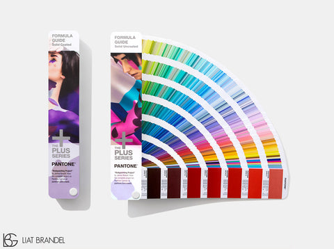
Pantone color palette, available here
Why do you need it? The idea behind the Pantone color palette is the ability to give designers a tool for maximum color matching. You can call it a kind of broad common denominator between designers and printing people from all over the world. So, for example, a graphic designer on one side of the world can print a graphic on the other side of the world and be sure that the color he intended is exactly the same color that will be printed: "Could you please print this for me in Pantone shade 13-0645?"
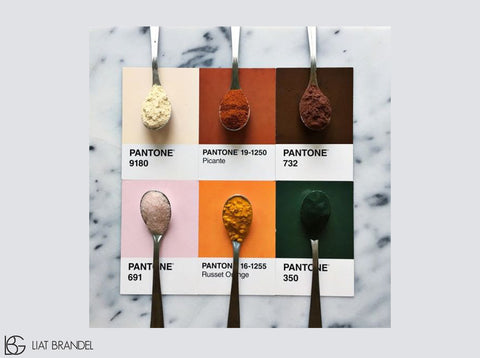
of Lucia Litman's Instagram who created a collection of images linking foods and Pantone colors. These images are tagged with the hashtag Pantoneposts#
A matter that has become a tradition: once a year the Pantone company determines the "color of the year". The worlds of fashion and design have been relying on this choice for years. The color of the year for 2017 chosen by the color giant Pantone is the shade Greenery: "a yellow-green shade reminiscent of the first days of spring".
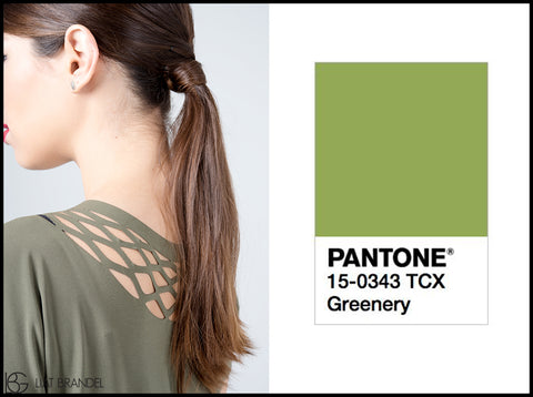
The color of the year 2017 according to the Pantone global company: Greenery green shade
In an interview of the CEO of the company to the New York Times, she reasoned: "We know what kind of world we live in. It is very stressful and tense. This shade is the color of hope and of our connection to nature. It says the words.... Be refreshed, be reborn , renewed".
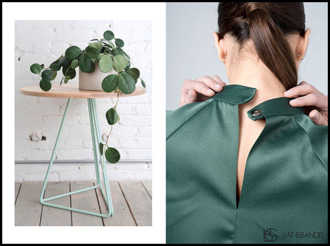
"The color of hope and of our connection to nature."
Right: My dress (Liat Brendel), available here | On the left: a picture of a plant, taken from here
Full disclosure: green has always been my favorite color. It is a color that makes the heart feel good and goes with everything. Thanks to my clients, I also learned that this is a color that goes well with many shades of hair and is also very suitable for special events.
In honor of the new season, I designed for you two unique green dresses. One - for the evening, and the other - for everyday. Which one do you like the most?
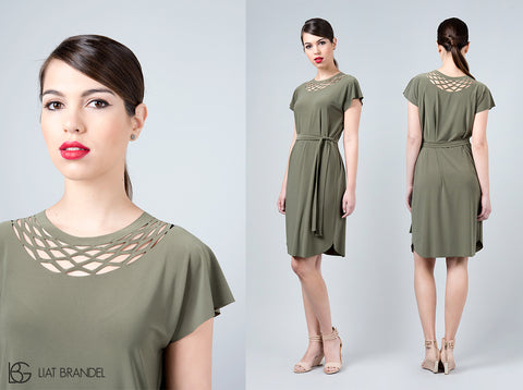
New khaki green chain dress. Suitable for everyday but not only, all the details are here
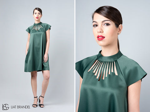
A new green dress from the new collection in a flattering and special green color, all the details are here


Leave a comment